NBCUniversal
Data Visualization Experience Designed and Created For CES and Super Bowl XLIX
Context
As part of NBCUniversal’s growing interest in marketing their increasingly data-driven capabilities, they asked us to design an experience around data related to all of their television properties. To help them achieve these goals, we crafted an experience making it possible for users to find interesting relationships that relate to them as TV watchers from among a vast NBCUniversal data set. To date, this experience has been installed at CES in Las Vegas and at the Super Bowl.
Details
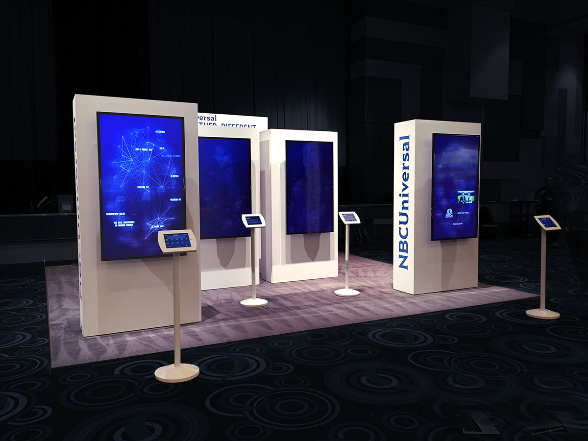
Users interact with an iPad to control data visualizations displayed on large screens in front of them. On the iPad is a fun, simple quiz. As users answer quiz questions about their viewing habits, the various elements inside the large-screen visualizations automatically shift their position to arrange themselves according to the user's responses. Each of these changes in the visualization reveal to the user an increasingly precise profile of the kinds of properties they might find interesting.
With respect to the design and engineering at work in this, the large-screen visualization is a network graph where the nodes are TV show titles and where edges (aka lines) connect each title to reflect the relationships between each of the shows. The relative distances between each of the nodes reflects their relative affinity (or similarity) the shows have to one another. In the end, those shows most closely reflecting the interest of the user tend to cluster together.
Also with respect to tech, the codebase for the graph makes heavy use of simulated physics to produce lifelike animations. Because of this the characteristics of the dataset also play out in how the visualization conveys information. For example, a cluster of TV show titles with a lot of similarity in the data will cluster tightly together because they have more gravitational attraction to one another. As a result, for a show outside that network to affect that cluster - to start pulling it apart - that show would have to be very popular to have enough gravity to loosen up that grouping.
We needed a lot of data to make all this happen so we designed a system to collect social data concerning all their shows and crossed it with a variety of other data sets to build a network of affinities between shows. The result of this synthesis formed the backbone of the entire experience.
For this project we partnered with a hard working and extremely talented design and management team at Interbrand.